Reassuring by design
Quiet colors, generous space, and a considered identity communicate care without feeling cold.
 SELECTED CONCEPT / 01
A brand and digital experience for a primary care practice that puts people at ease, before they even walk through the door.
Explore the thinking ↓
Choosing a doctor is personal. The brand should make that decision feel a little easier.
Our concept brief: create a modern, relationship-led primary care practice for adults who want clear answers, continuity, and a clinician who knows their story.
The challenge was to balance clinical confidence with human warmth—then carry that balance from the first search to the waiting room.
Quiet colors, generous space, and a considered identity communicate care without feeling cold.
Plain-language services and visible next steps help patients understand where to begin.
The physician, approach, and ongoing care take priority over generic medical imagery.
“Care that knows you.
Clarity that stays with you.”
Wellspring suggests a steady source of care, support, and renewal.
A calm wordmark keeps the practice approachable. Deep teal anchors the identity; aqua adds freshness. Soft ivory gives the system breathing room, while dark text keeps important information clear.
Editorial serif headlines bring warmth. Straightforward sans-serif text makes details easy to scan. The wordmark stays simple and recognizable at small sizes.
Say “Let’s talk about what’s on your mind.”
Say “Here’s what to bring to your first visit.”
Use familiar words, explain the next step, and avoid promises about outcomes.
Recognition builds through repetition: the name on the door, the embroidery on a coat, the card a patient takes home, and the welcome materials that make the first visit feel easier.


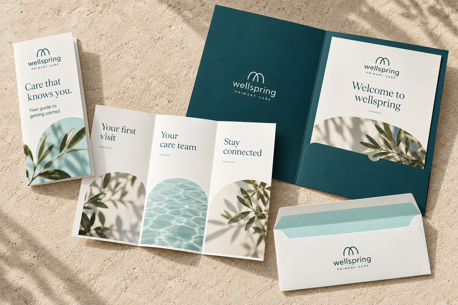
A welcoming introduction to the practice, with a simple overview of care and how to prepare for the first visit.
A cohesive home for welcome information and visit documents, making important papers easier to keep together.
A recognizable finishing touch for practice correspondence, with a restrained exterior and fresh aqua lining.
The journey begins with uncertainty. Each touchpoint has one job: make the next step feel clear.
A clear promise, relevant services, and a welcoming first impression.
Website introductionA visible physician, a personal care philosophy, and an explanation of the visit.
Meet your doctorOne clear appointment action, plus practical guidance on insurance and new patients.
Appointment pathwayHelpful preparation, recognizable signage, and consistent language in the office.
First visit & ongoing careA clear invitation. A real sense of the practice. An obvious next step.
Explore the homepage concept below. The preview shows how the identity becomes a useful experience, from understanding care options to preparing for a first visit.
The headline addresses the person, while the appointment action stays easy to find.
Services are organized around everyday patient needs, with concise descriptions.
The first-visit guide answers practical questions before a patient commits.
Frame the audience, the practice’s promise, and the barriers to choosing care. For this self-initiated concept, patient needs are design hypotheses rather than interview findings.
Translate reassurance into the name, wordmark, palette, typography, and voice. Check that the identity works on both small printed materials and architectural signage.
Sequence the homepage around patient questions: fit, trust, services, and the first visit. Keep the primary appointment action consistent throughout.
The next stage for a real client would test comprehension and appointment usability with patients, verify clinical and insurance content, and check accessibility before launch.
A cohesive identity and patient-focused website concept, designed to make the first hello feel like the beginning of a lasting relationship.
Back to the beginning ↑Bring your practice’s story to life with a thoughtful brand identity and a website that makes the next step clear.
Let’s talk about your projectBrand strategy · Visual identity · Website design