SELECTED WORK / 01
Confidence starts
with feeling understood.
A complete brand experience for AVEN Plastic Surgery.
Considered care. Clear choices. Quiet confidence.
Less pressure.
More possibility.
Choosing a surgeon is deeply personal. The brand should make space for questions before asking for a commitment.
AVEN is an imagined plastic surgery practice built around a simple idea: people deserve to feel heard, informed, and supported. We translated that idea into a calm identity and an easy-to-follow digital experience.
Replace uncertainty
with understanding.
Clinical language can feel distant. Transformation-led marketing can feel pressuring. AVEN needs an approachable middle ground.
Thoughtful people.
Personal decisions.
Adults exploring aesthetic or reconstructive care who value privacy, clear information, and a conversation about their individual goals.
Expertise expressed
through thoughtful care.
A premium experience defined by listening, realistic expectations, and continuity before and after a procedure.
A short, open-sounding name that suggests an avenue forward. Easy to say, memorable on a door, and distinctive enough to anchor a complete visual system.
Concept name; trademark and domain clearance remain a launch step.
THE BRAND PROMISE
“Your goals.
Your pace.
Care, considered.”
A clear point
of view.
Editorial elegance meets clinical clarity.
The spacious serif wordmark gives AVEN a composed presence. A simple A becomes the compact signature; repeated letterforms create a restrained pattern for packaging and paper.
01 / PRIMARY LOCKUP
02 / WORDMARK
04 / REVERSED LOCKUP
Room to breathe. Keep clear space equal to the height of the A around each lockup. Use the monogram when the full descriptor becomes too small to read.
One consistent voice. Use solid navy or white, preserve proportions, and avoid shadows or gradients. Mockups illustrate the direction; production artwork needs final optical refinement.
Select a swatch to copy its color. Navy anchors readable text; steel blue is reserved for accents.
Aa — Considered.
Georgia / expressive headings and wordmark concept
Clarity in every conversation.
Arial / readable navigation and everyday information
A A A A A A
A A A A A A
A A A A A ATHE AVEN SIGNATURE PATTERN
Every detail.
The same feeling.
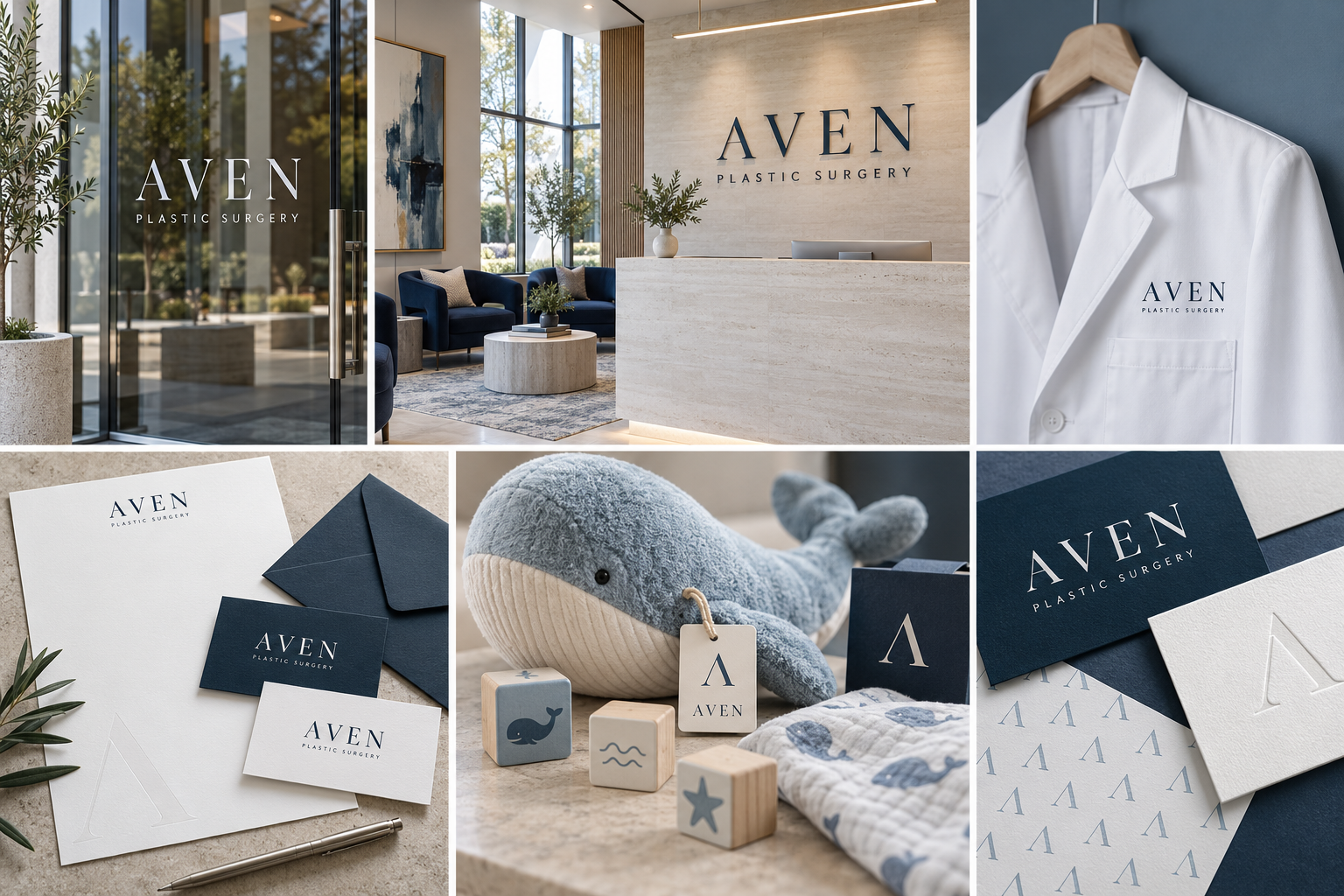
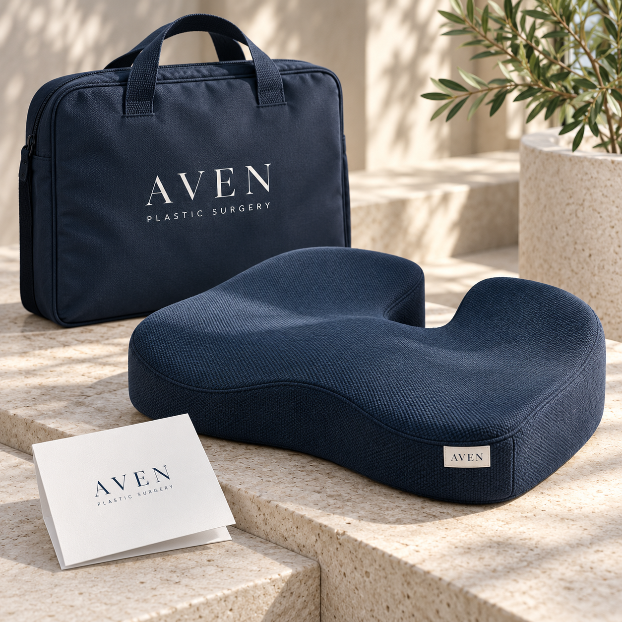
The reassurance of the website should follow a patient through the front door, into the waiting room, and all the way home.
Designed around
their questions.
What are my options? Who will care for me? What happens next?
The website answers these questions in that order. Clear pathways, a visible care philosophy, and a gentle invitation to talk create a more informed first step.
A decision this personal
starts with you.
Space to ask questions. Time to explore your options. A conversation about what matters to you.
Start with a conversation, at your pace.
Explore your options.
First, we listen.
Your priorities shape the conversation. Explore the pathways above to see how the site helps a patient prepare for a consultation.
A reassuring first impression
Human language and a welcoming interior introduce the experience without idealized bodies or pressure to change.
Options before conversion
Simple care categories help patients orient themselves. Deeper pages would explain suitability, limitations, recovery, and alternatives.
An honest next step
A consultation invitation describes the conversation. No invented reviews, outcome claims, or urgency tactics are needed.
Trust is built
one step at a time.
The journey connects a first visit to the website with real-world care. Select a step to explore the design thinking.
This independent portfolio concept uses a fictional client and AI-generated application mockups. Before launch, the practice would supply verified clinician credentials, approved service information, consented imagery, and a secure enquiry workflow. Proposed success measures: information findability, consultation completion, and patient-reported clarity. No performance results are claimed.
